


Grid layout is quickly becoming one of the most popular ways to structure and design web pages. Using a grid, you can create a well-organized and visually appealing website that is easy to navigate. This blog post will share some tips and tricks for using grid layouts in your web design projects. We will also show you how to create a basic grid template using HTML and CSS. So if you are interested in learning more about grid layout, keep reading!
Rules for creating grid layouts in web design
Grid layout is one of web design’s most popular and widely used layouts. It is a very versatile layout that can be used for various purposes, such as creating responsive web designs, building complex web applications, or simply organizing content on a page.
There are many different ways to create a grid layout. In this article, we will explore some of the most effective tips and strategies for using grid layouts in web design.
- Use a Grid System
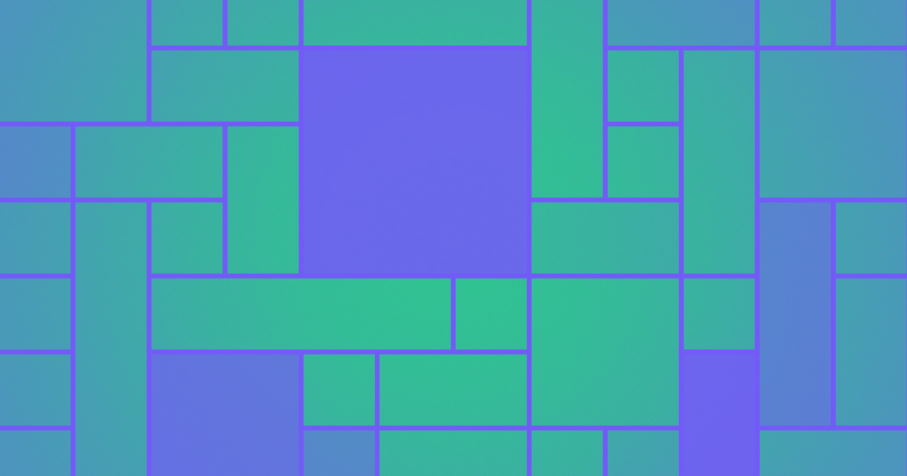
One of the best ways to use grid layout in web design is to employ a grid system. A grid system is a framework that helps to organize and structure content on a page. There are many different types of grid systems available, but the most popular and widely used is the 12-column grid system.
- Make Use of Negative Space
Another effective tip for using grid layout in web design is to use negative space. Negative space is the space on a page that is not occupied by content or visuals. It can be used to create visual balance and harmony on a page, as well as to highlight certain elements.
- Use Contrasting Colors
Contrasting colors can also be used to great effect in a grid layout. Using contrasting colors can help create visual interest and depth and emphasize certain elements on a page.
- Utilize Different Font Sizes
Utilizing different font sizes is another great way to add visual interest and variety to a grid layout. Using different font sizes can help to create hierarchy and emphasis, as well as to add personality to a design.
- Use Images and Visuals
Images and visuals are also great elements to use in a grid layout. They can help to break up the monotony of text-heavy pages, as well as add visual interest.
Grid layout is a powerful tool that can be used in a variety of ways in web design. Following these tips, you can learn how to use grid layout effectively and create beautiful, responsive, and user-friendly designs.
Types of grid-based layouts in web design
There are a few different types of grid-based layouts that are commonly used in web design. The most popular type is the 12-column grid, which is often used in responsive design. This grid type is divided into 12 equal columns, each used for a specific element on the page.
Another common type of grid layout is the 6-column grid. This type of layout is often used for pages that are not as complex as those that use a 12-column grid. In addition, the 6-column grid allows for more flexibility in terms of how the content is laid out on the page.
The third type of grid layout is the 3-column grid. This type of layout is typically used for pages that are very simple and don’t require a lot of content. The 3-column grid is divided into three equal columns, each used for a specific element on the page.
Whatever type of grid layout you choose, it’s important to remember that the content must be easy to read and understand. The layout should also be easy to navigate so that visitors can find what they’re looking for quickly and easily.